ABOUT PROCESS
Process is obviously incredibly important in design. Doing it right is the difference between making something based on guesswork and creating something that can actually improve the way that people get their jobs done. Unfortunately, the pursuit of the ideal UX process can get lost in the day to day of trying to get something technically feasible out the door. In fact, I don’t think that the ideal design process actually exists outside of textbooks. There are too many factors at play, too many parties with stakes in the game, too much change over time.
What really exists, is a challenge that’s framed by a particular set of time, resource, and technical constraints. Within that framework, we need to make something that delivers actual value to users. To try and make this a relatively quick read, I’ll use a particular simple widget that I created for visualizing a particularly confusing thing that happens in a NetApp/SolidFire system.
1: FIGURE IT OUT FOR MYSELF
When you design highly technical products for experts in their given field, you will often jump in flat-out not really understanding what the information means and why users care about it. The first step in being able to deliver value to users is to understand what you’re trying to get across to them.
Since I’m going off of the assumption that I’m designing a visualization for a hard-to-understand metric here, let’s also assume that I’m just trying to come up with an effective way to communicate this information. This principle, however, would also apply to workflows and high-level user journeys.
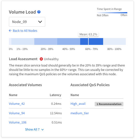
In this particular case, I was trying to get a metric called“Slice Service Load” in front of users. To understand what this actually was, I met with a few people from the engineering team and looked at online documentation, which was pretty lacking. After a good amount of explanation, I gathered that this metric conveyed the distribution of time spent within 5 different ranges for the burden on a particular process (the slice service) on a per-node (single server) basis.
2: ASK MYSELF: "WHAT'S THE INSIGHT?"
The information that’s supposed to be conveyed in this case is pretty complicated. It helps to take a step back and ask “what can a user glean from this and what can they do about it,” which can then help you form a statement “from the user” that will frame what exactly you hope to accomplish. In this case, it was something like “Node 3 is spending more time in the 60%-80% range than the other nodes. I looks like volumes x, y, and z are associated with this node, soI should check their performance and QoS policies and adjust to fix.”
3: WHAT DO USERS NEED TO KNOW TO GLEAN THIS INSIGHT?
To gain the insight mentioned above, I would need probably need to show:
The distribution of time spent within each threshold for each node
What’s a “bad” distribution and what’s an “ok” distribution
The association between these distributions and volumes
The association between volume performance and QoS policies
How the QoS policy needs to be changed to fix the problem
4: IDEATE
Now that I know what information needs to be conveyed, it’s time to ideate on the best way to display that information. To me, this is really just a matter of cranking out as many options as I can and putting them on the page. Here’s are some screenshot of my Sketch document with a handful of different approaches. The color variation is due to the fact this this widget would be displayed in two different apps with different color schemes.
In general, I started with some more traditional visualizations like bar and pie charts, but found that it took a lot of mental gymnastics to get them to work cleanly with the type of information I was trying to show. I eventually started leaning toward more of a heatmap approach.

5: NARROW DOWN AND REFINE
Throw out the Bad Ideas
Some things are just bad ways to tackle the problem or are too “out there” to be feasible or useful. In general, the most simple and comprehensible solution is the best way to go. In this case, around three different approaches were trashed for this reason.
Throw out what Can't be Done Due to Technical Limitations
You should have a good understanding of this going into the design work, but sometimes you come up with ideas that may or may not be technically feasible given your current resources. In my case, there were a few different visualizations that I wanted to do that we didn’t have any similar charts for and the chart library we were using didn’t have a preset to make it work quickly. These approaches needed to be trashed for this reason.
After things had been narrowed down, I landed on the approach below, which worked well for a few reasons:
It provided a quick, visual way to identify outliers in the system based on a heatmap and health statusing.
It made the best possible explanation of a confusing relationship (both variables were percents).
It allowed users to drill down to a screen that allowed them to answer all questions from my insight section above. Being able to tell them which QoS policy actually had a problem proved to not be possible, so we just showed them which policies had recommendations (another feature on the same page of the app).
6: SUPPORT DEVELOPMENT
This was a cool feature to support because I was working with the lead engineer on one team, along with a data scientist who just innately got what I was trying to show, and the best way to write the code to color the heatmap in a way that was easy to perceive for users. He ended up writing a logarithmic function to drive the coloring, otherwise the lighter colors ended up looking too dark.
Things often come up during development to where designs need to be changed or altered to make it work. You have to just roll with the punches and provide your best recommendations. I usually take the original vision for my design as the “North Star” and allow for it to be watered down but will create follow-up stories and bother specific dev teams to pick up enhancements to the features. Stuff falling through the cracks and never being developed is also a big risk though, so you need to be vigilant and have a good memory.
In terms of process, I used Zeplin to communicate specs to developers in this case, but for the last month or so, I've been using Figma, which has built-in dev handoff features.
WRAPPING IT UP
In general, that’s my process from initial discovery to final development of the feature. This particular example uses a rather small feature focused on data visualization that started with pretty well-defined original requirements, but I think that my general process can be applied to almost any type of feature. Thanks for reading!